Guide to Choosing the Right Colors for Your Product Packaging
By: phase1You may have developed the perfect product. You may have developed the perfect way to source it, manufacture it and transport it to market. In the end, though, regardless of your product’s innate quality, you will likely have to depend on its packaging to sell it. Color — among the most basic of human sense signals — will play a huge role.
Research studies have shown that around 80 percent of buying decisions are made according to exterior factors such as packaging, and color accounts for about 65 percent of that impact.
To draw an analogy, it’s the car’s exterior that often sells it. Its lines, its curves, its color. Its visual zing. Not the quality of its automatic transmission, even if it’s made with rare earth minerals and the finest of titanium alloys.
The reason is simple.
Color registers with the human brain almost instantaneously, generating emotions and reactions long before logical reasoning can kick in to analyze a set of inputs.
So, if designing other aspects of your packaging is critical — like making sure it’s a proper container for your product with a handy dispenser, that it’s safe and reasonably inexpensive to produce and that it communicates your brand message — color choice is of paramount importance.
The choice is perhaps made doubly important by the fact that simplicity is a virtue. Research shows that 95 percent of major brands use only one or two colors in their branding strategies. The simple red target of Target stores is a prime example. Thanks to the strong use of a single color and an iconic symbol, the brand often appears with no words at all. Coca-Cola is another — the classic logo is always red and white.
This is done because simple branding is easiest for the brain to process and absorb quickly. And simple branding with color carries instantaneous emotional messages, as well.
Thanks to years of research, the question of how to choose colors for product packaging can be answered through a rational analysis of your situation. Start with the standard emotions that certain sets of colors generate in the human mind.
While everyone reacts to specific colors a little differently, broad ranges of reactions can be predicted. Bright red and orange, for example, burn with heat, danger and immediacy, while lighter tints of pink signify only warmth. Bright blue may freeze like ice, while purple — a mix of red and blue — is as sensuous as a soft pillow. Green is nature, which could mean a fresh leaf or pond slime, depending on the context. And so on.
These are the types of reactions that will greet your potential customers’ eyes first if you use these colors. So, on an intuitive level, it’s easy to see why using hot orange to sell icy cool gum and green to sell fresh milk might not be a good idea, while red to push the youth, vitality and fun of Coca-Cola is the perfect choice.
How can you systematically choose the best colors for product packaging that will fit your particular marketing aims? It’s best to start with the science of color and a realization of how, and why, some color combinations work the way they do.
Table of Contents
- Packaging Color Psychology — The Color Wheel
- Analogous Colors
- Complementary Colors
- Other Terms to Consider to Choose the Best Colors for Product Packaging
- Best Colors for Food and Beverage Packaging
- Alcohol — Choosing Colors for Product Packaging
- Candy and Toys— Color Packaging Psychology
- Sporting Goods — Color Packaging Psychology
- Housewares
- Importance of Prototypes
Packaging Color Psychology — The Color Wheel
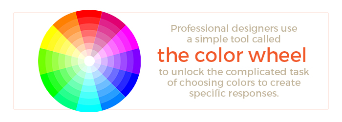
Professional designers use color psychology and a simple tool called the color wheel to unlock the complicated task of choosing colors to create specific responses.
The wheel shows how colors relate to the three primary colors — red, yellow and blue. The primaries get their name because they cannot be created by combinations of any other colors. They, instead, are the colors that all other colors are made of.
Green, for example, is a combination of blue and yellow, so it sits exactly between those two primary colors on the wheel. Orange, the combination of red and yellow, sits between those two, and purple is the combination of red and blue. These three are known as the secondary colors.
All other colors fall into an array between the primary colors on the wheel, depending on the degree to which they contain the primary colors.
At this point, it’s worth mentioning that black — the absence of color — typically denotes mystery, authority and a kind of James Bond elegance, while white — the presence of all colors — tends to soften everything.
Aside from those two cases, the location of colors along the color wheel can tell you a great deal about how they will affect humans if they are used in combination. The color wheel can help identify your packaging color combinations.
Analogous Colors
Analogous colors are all the hues that fall between two primary colors on the wheel. If used together, they will produce a harmonious effect. The three groups of analogous colors tend to produce different types of responses in the brain — the orange group signals alertness and high energy, the green group an earthy energy and the blue group calm, control and sensuousness.
But regardless of the group, the fact that the combination works together is relatively calming.
Check the logo for Green Tea Powder, for example, with its warm hues of green calmly reflecting the company’s natural product and the green mountain slopes it comes from. Or the analogous blues of Iceberg Pure Glacier Water casting ice on the consumer’s palate before they even take a drink.
Complementary Colors
Complementary colors are hues that fall on opposite sides of the wheel. They tend to make each other look brighter when used in combination, jarring the senses awake and adding energy.
Professional football teams frequently use these. Think the purple and yellow of the Minnesota Vikings or the blue and orange of the Denver Broncos. Products use them for the same reason — to project an aura of energy.
The Aquafina water brand, for example, uses analogous shades of blue dotted and slashed with bright orange to combine the sensation of energy and activity with cool refreshment. And the classic Gatorade logo mashes green with a blazing orange lightning bolt — just in case you miss the color message of high energy to begin with.
Other Terms to Consider to Choose the Best Colors for Product Packaging
Obviously, the little color wheel does not contain every conceivable color and color quality. It simply contains the root colors that all others are derived from. How does this expand into the thousands of hues you can find in a typical paint store?
Through the simple addition of black or white.
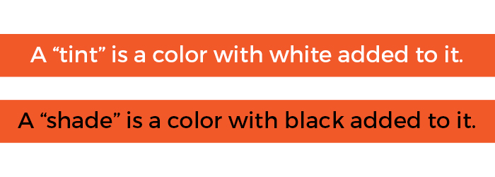
A “tint” is a color with white added to it. This can result in a color that’s very close to the primary, thus remaining deep and bright. Or, adding a lot of white can turn red to pink, softening its effect altogether.
A “shade” is a color with black added to it. This can either result in a color that is very close to the primary, but deepened a bit, like a colonial red. Or, it can result in a color that’s dulled and almost muddied to brown.
Put tint, shade and their initial colors together and you get qualities of “tone,” which indicate a color’s degree of brightness or dullness.
Taken together, these are the terms and techniques that professional designers start with when they narrow the color spectrum down to the color or colors that you should use to sell your product.
It’s important to remember throughout your design phase that “design” is a process that starts with a concept, but typically requires testing to perfect. Phase 1 Prototypes produces prototype packaging that can help you not only do proof-of-concept on the production end, but also give you samples to test with real people to make sure your key color and brand messaging is coming through in the way you intended. Color can help solidify your overall brand identity.
While prototypes and testing are crucial to producing your final package, you need to start with ideas and concepts. So, let’s take a look at the way color theory has come together to find solutions for certain products in particular categories.
Best Colors for Food and Beverage Packaging
Color theory has been used in formulaic ways for so long in the food industry that the aisles in grocery stores are almost color-coded to indicate the product types they hold. This is because food marketers have learned that certain colors call up certain emotions in hungry people.
Red, for example — the most universally used color in food packaging — actually triggers the appetite and is associated in the mind with freshness. Think ripe tomatoes, dappled with dew.
Green is associated with health and natural foods. Yellow, a color that actually induces the release of happiness-producing serotonin in humans, is associated with sunshine and good cheer. Think breakfast cereals and fun candies. Orange is associated with heartiness and satisfying foods, like the eponymous fruit. And blue is typically found on fun foods, like cakes and cookies — Kelloggs Rice Krispies Treats, for example — and other things that appeal to children or the child in us. Blue is an appetite suppressant, though, so it’s hardly ever found on natural foods.
There are exceptions to these longstanding traditions, and it’s worth looking at one in particular to get an insight into how product positioning can work. Consider the case of the Crown Prince Sardines shipping box produced by Phase 1 Prototypes. Sardines are arguably a natural food, so the box’s monochrome royal blue is surprising.
That’s only on the surface, though. Blue calls up impressions of the waters that sardines come from, conjuring smells of the sea and the silvery shimmer of food for anyone who’s hungry for snack fish. At another level, blue also denotes calming authority, which is why royal blue is the color of, well, royalty — a play on the product’s “Crown Prince” name. These subtle twists work for that particular product.
Alcohol — Choosing Colors for Product Packaging
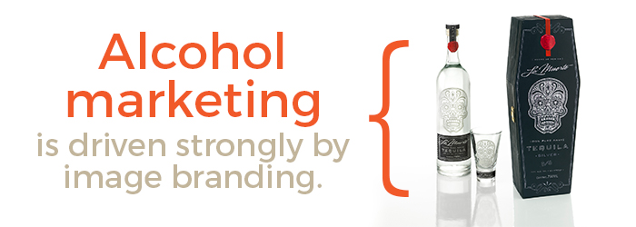
As with perfume, alcohol marketing is driven strongly by image branding. While some color connections are fairly obvious ties to flavor, such as dark reds for wines or green apple for an apple flavored vodka, more often than not color is used to evoke a raw emotion rather than to reference an actual attribute of the product. As a result, it’s best to start with the market niche you’re trying to guide your product into and work back from there.
Do you want to evoke an image of general refreshment? Blue or shades of gray spark images of ice and calm refinement, while black and red, in combination, denote a timeless elegance.
And then there’s the bright red hat and coat in the Captain Morgan Rum label, reinforcing the brand’s image of rakish fun and adventure. The lesson here? Don’t be afraid to take a chance with a bold color to give your product a unique voice.
Candy and Toys— Color Packaging Psychology
Blue is a predominant color for snack packaging, including candies, and it’s frequently found in the mix on toys, as well. But yellow is often more of a key factor. Serotonin, a neurotransmitter that encourages feelings of happiness and well-being, is actually released when the human eye encounters a strong yellow. Since everyone wants to feel good when they buy a toy, whether they’re a child or an adult, it’s a natural fit.
Many toy packagers also throw in some red or orange for a sense of energy and to help stand out on crowded toy shelves. The result is often a multi-colored splash, like the Slap Wacky! game box, which looks like it might jump off the shelf and into your cart of its own volition if you don’t move down the aisle fast enough.
While over-the-top color schemes often work in these child-oriented niches, it also pays to recognize the important role that tinting and shading can play. For example, Lovely Candy is shooting for a softer, more natural and higher-quality image that helps to set it apart from the loud world of highly processed confections. So, the company’s packaging — produced by Phase 1 Prototypes — uses muted tints of red, blue and yellow-green for a softer, more adult feel, while preserving the fun of the basic colors.
Sporting Goods — Color Packaging Psychology
Few things are associated with the great outdoors as strongly as sporting goods, so strong greens, browns and oranges dominate, along with black to denote strength. Thus, the Dick’s Sporting Goods logo. What do you need besides forest green, with a little burnt orange to jolt in some energy?
Possibly a lot, depending on the niche you want to fill.
While almost all strength-training equipment is predominantly black, for obvious reasons, some varieties of equipment, like skis and golf clubs, shoot for image over substance almost to a degree that rivals alcohol or perfume marketers.
For that reason, the ski equipment racks are often filled with complementary color sets — bright blues with oranges or yellows, or greens with purple, for maximum energy. Meanwhile, golf equipment color schemes often lean towards executive-oriented hues, such as red and black or steel gray and ice blue.
Housewares
This is a broad category of products, where color choices depend on the basic feeling you want your product to convey. Does it use natural and organic materials? Yellow, burnt oranges and greens are natural choices. Are you shooting for cool elegance, or a seaside air? The blue chromatic scale, along with blacks, greys and heavily shaded reds should draw your eye.
Tinting and shading are very important here. Lighter tints and pastels will generate a softer feel, while darker shades will generally convey earthiness and weight or, in the case of purple, sensuousness.
Importance of Prototypes
Once you have settled on a color or color combination, it’s time to test it. There’s no substitute for mocking up a prototype so you can see for yourself — or your customers can help you see — whether your initial concepts actually reach the goals you set out to hit with your creative packaging.
Think of your package as your salesperson. The prototype is its sales floor tryout.
Phase 1 Prototypes can help you with all aspects of prototype design and production. To discuss your project and get a quote, get started by contacting us today.


